
Redesigning how 10M+ users choose, compare, and commit to a streaming subscription — then building the system that made plans infinitely configurable.
PROBLEM
Viu's subscription revenue was negligible despite rapid market expansion — and a one-size-fits-all paywall couldn't flex to the pricing, plans, and cultural expectations of each new market it entered
WHAT I DID
I led user-research and designed a configurable subscription system — flexible enough to handle varied price points, plan structures, and regional partnerships — backed by a robust design system that ensured every configuration rendered consistently across markets.
IMPACT
• Increase in coversion rates by 20%
• Augmented foundations of Design System
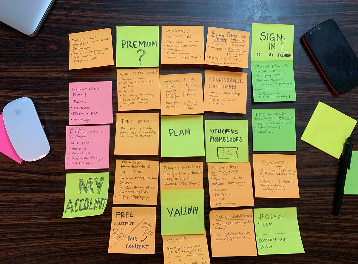
RESEARCH
Our user research showed Viu's subscription funnel had three compounding problems: users didn't understand the value, couldn't compare plans clearly, and found payments stressful. This research became the cornerstone to lead the end-to-end redesign of the subscriptions experience across Southeast Asia and West Africa — improving conversion, then extending the system to support configurable plans with variable content privileges, pricing tiers, and billing cycles.
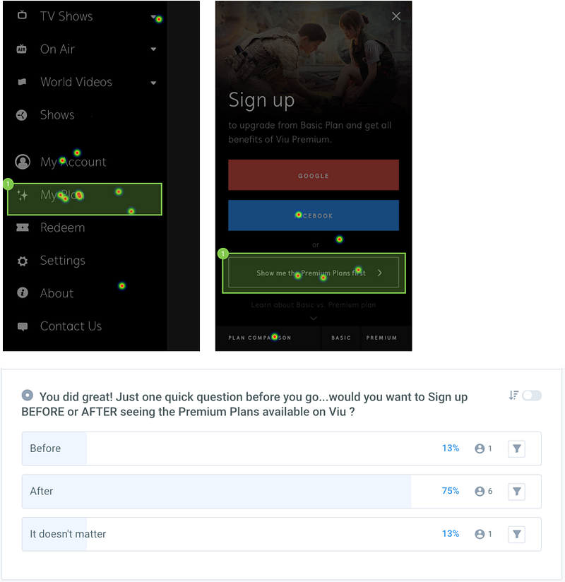
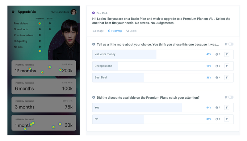
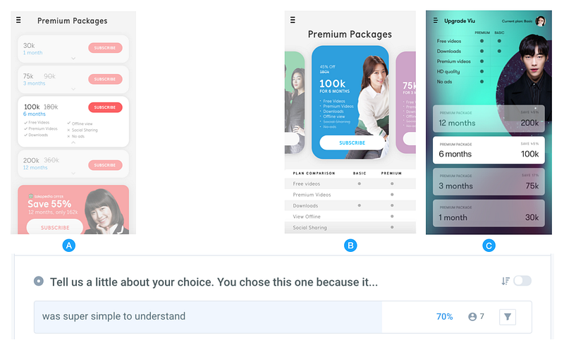
1. Plans were behind the sign-up wall, whereas user's preference to see them before . 2. User-testing concepts to understand how content like price-points, features, discounts influenced users to make a decsion.
THE PROBLEM:
Three distinct friction points were killing conversion at different stages of the funnel
1
Why should I subscribe?
Users couldn't articulate the difference between free and premium. Benefits were text-heavy and unscalable across markets with different content libraries.
2
Which plan is right for me?
The original design required expanding and collapsing cards to compare plans — a pattern that added cognitive load exactly where commitment was being asked.
3
This feels like a chore.
Payments flows on streaming apps are usually forgettable at best. On a platform built on entertainment, that was a missed opportunity.
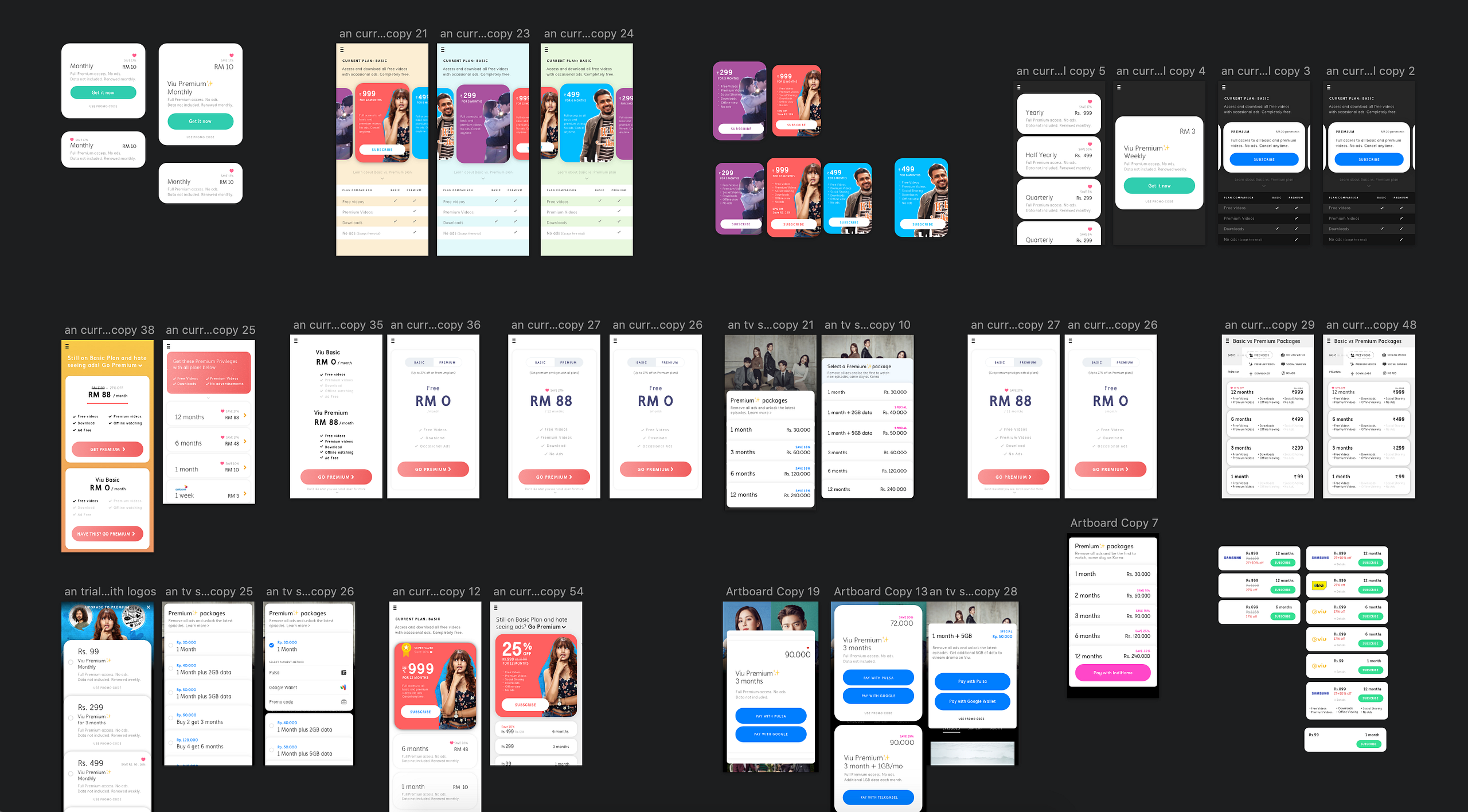
Early explorations to help users compare free and paid plan benefits side by side, and make the subscription journey more engaging through content.
THE SOLUTION:
1
Make the value visible, not readable.
I redesigned the Basic vs. Premium comparison to communicate benefits visually — scannable, market-adaptable, and honest about what you get at each tier.
2
One screen. Every plan.
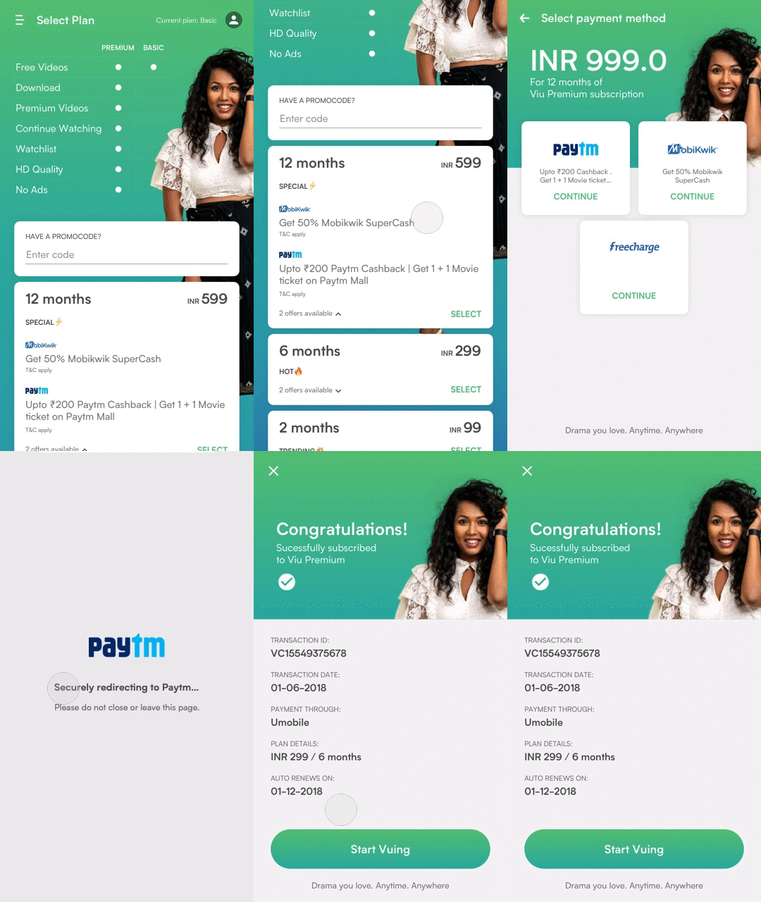
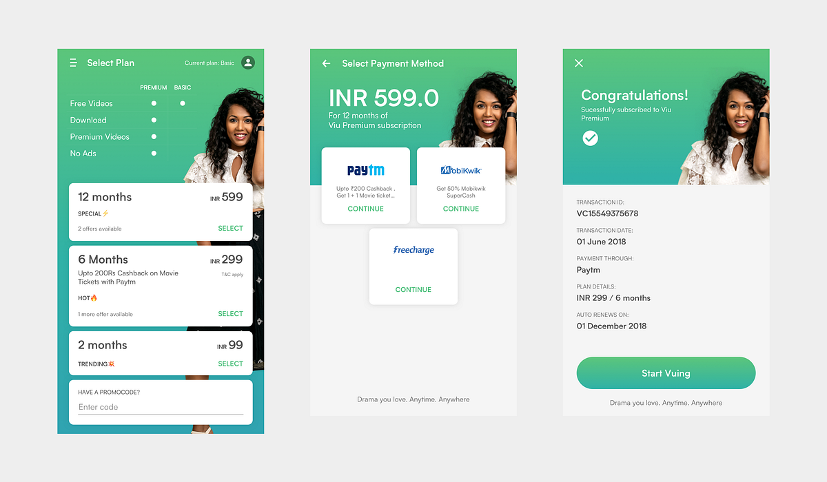
We replaced the expand/collapse card pattern with a flat layout that surfaces price points, billing cycles, and savings simultaneously. Users could make a decision without toggling anything.
3
Bring the product into the moment.
Viu is a content platform — so we pulled show art and characters into the subscription flow itself. Signup was repositioned as a secondary step rather than an upfront gate for organic users, reducing drop-off before users had seen the value.

CONFIGURABLE PLANS
After the initial redesign showed results, the brief expanded: could the system support plans where users choose not just price and duration, but content access and feature privileges too?
This required rethinking scalability from the ground up. We audited every component against the new plan matrix, identified where the existing patterns broke, and rebuilt the architecture to support a configurable plan structure — variable dimensions, not fixed tiers.
The output wasn't just a better UI. It was a design system for subscriptions: tokens, components, and layout rules that could absorb new markets, new plan types, and new content privileges without redesigning from scratch each time.
Tiered Plans
Different markets, different needs. We designed a plan matrix that could flex across price points, content access, and validity — without requiring a new design for every configuration.

Formidable Features
Each plan tier needed a clear, scannable feature breakdown. We built a component system that surfaced privileges and limitations honestly — making comparison effortless and upsell logic visible.
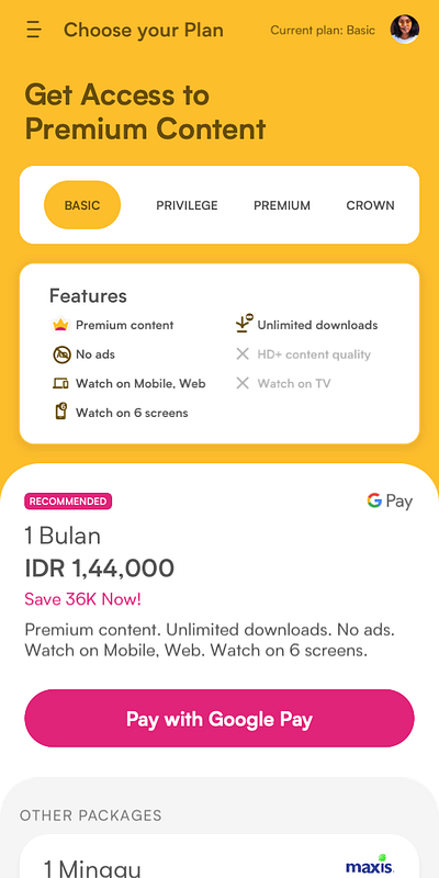
Recommendations and Payment Methods
Reducing decision fatigue at the final step. A smart recommendation surfaced the best-fit plan, and a streamlined payment flow got users from choice to confirmation in as few taps as possible.
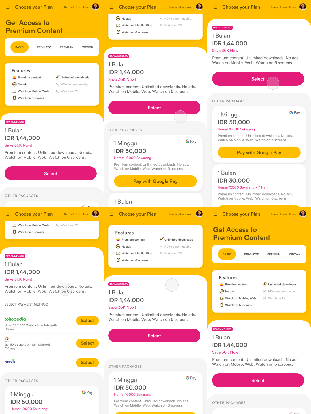
BUILT FOR EVERY MARKET
From Bahasa Indonesia's large-denomination currency values to Arabic's right-to-left layouts, the design system was architected to absorb regional variation — language, numerics, and directionality — without fracturing the experience.
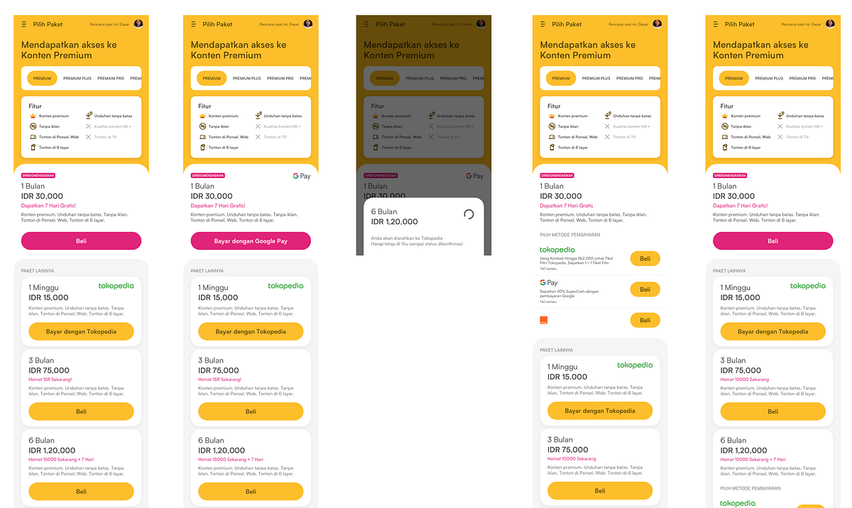
Design sacles beyond English: Indonesia Bahasa - Viu's majoirty user base
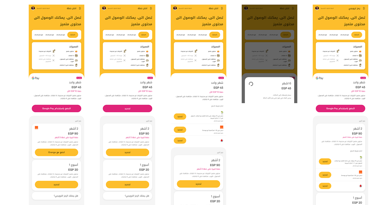
Regionalization for Middle East - Qatar, Saudi Arabia, Bahrain, Jordan, Kuwait, Oman
WHAT I LEARNT
Subscriptions are a trust product. Every friction point — unclear benefits, hidden billing info, opaque cancellation — erodes trust. Fixing UX here isn't polish; it's directly tied to revenue and retention.
Scalability has to be designed into the first solution. The configurable plans phase would have been significantly harder if the first redesign hadn't been built on clean component logic. The design system work wasn't a separate project — it was what made the second phase possible.
Organic users need a different contract. Making signup a secondary step rather than a blocker wasn't a minor UX decision. It reflected a different hypothesis about how trust is earned: show people the value first, then ask for the commitment.
Selected Works
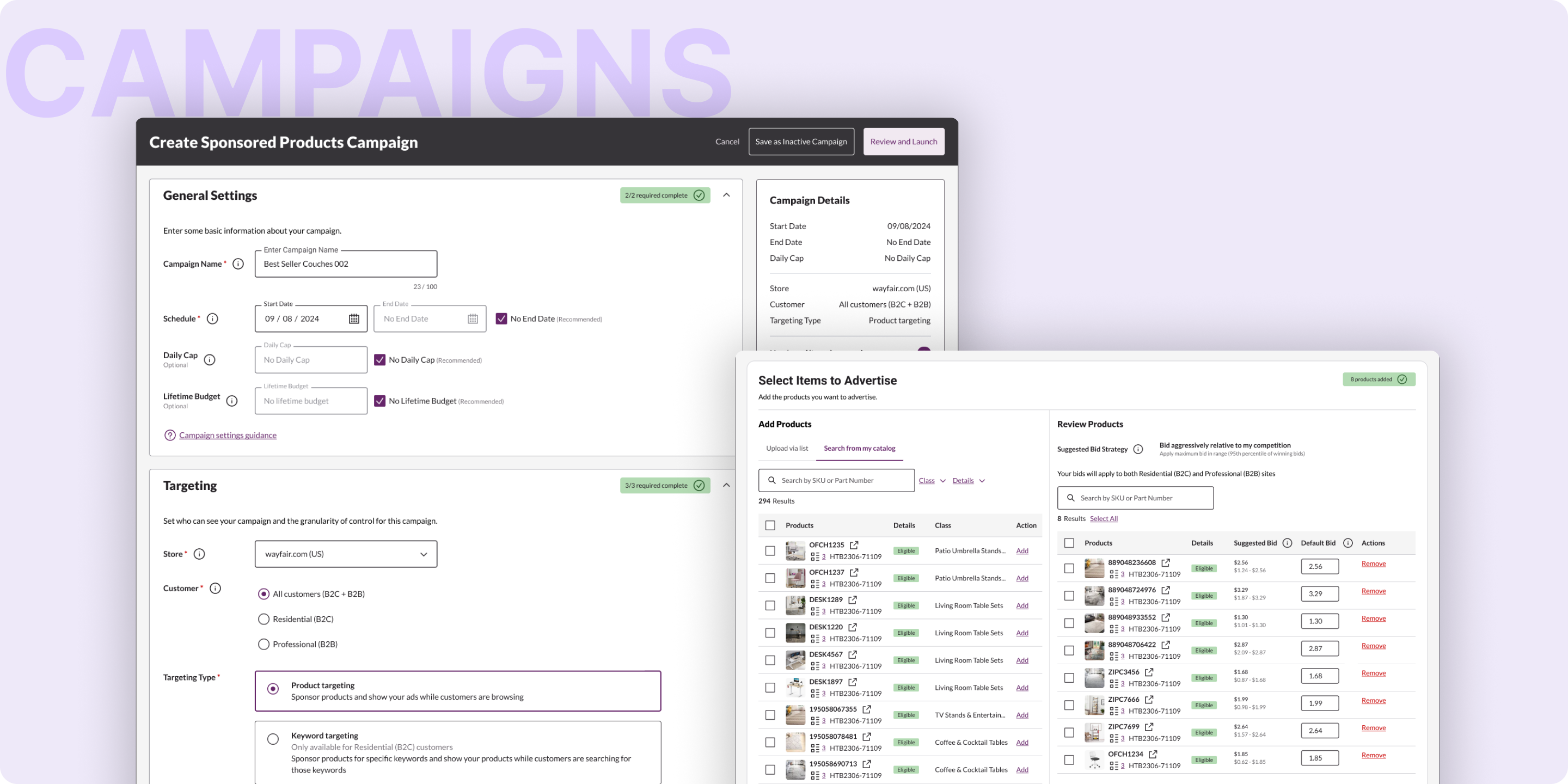
Wayfair - Unified Campaign Creation2024-2025 . Web . Vision & Strategy
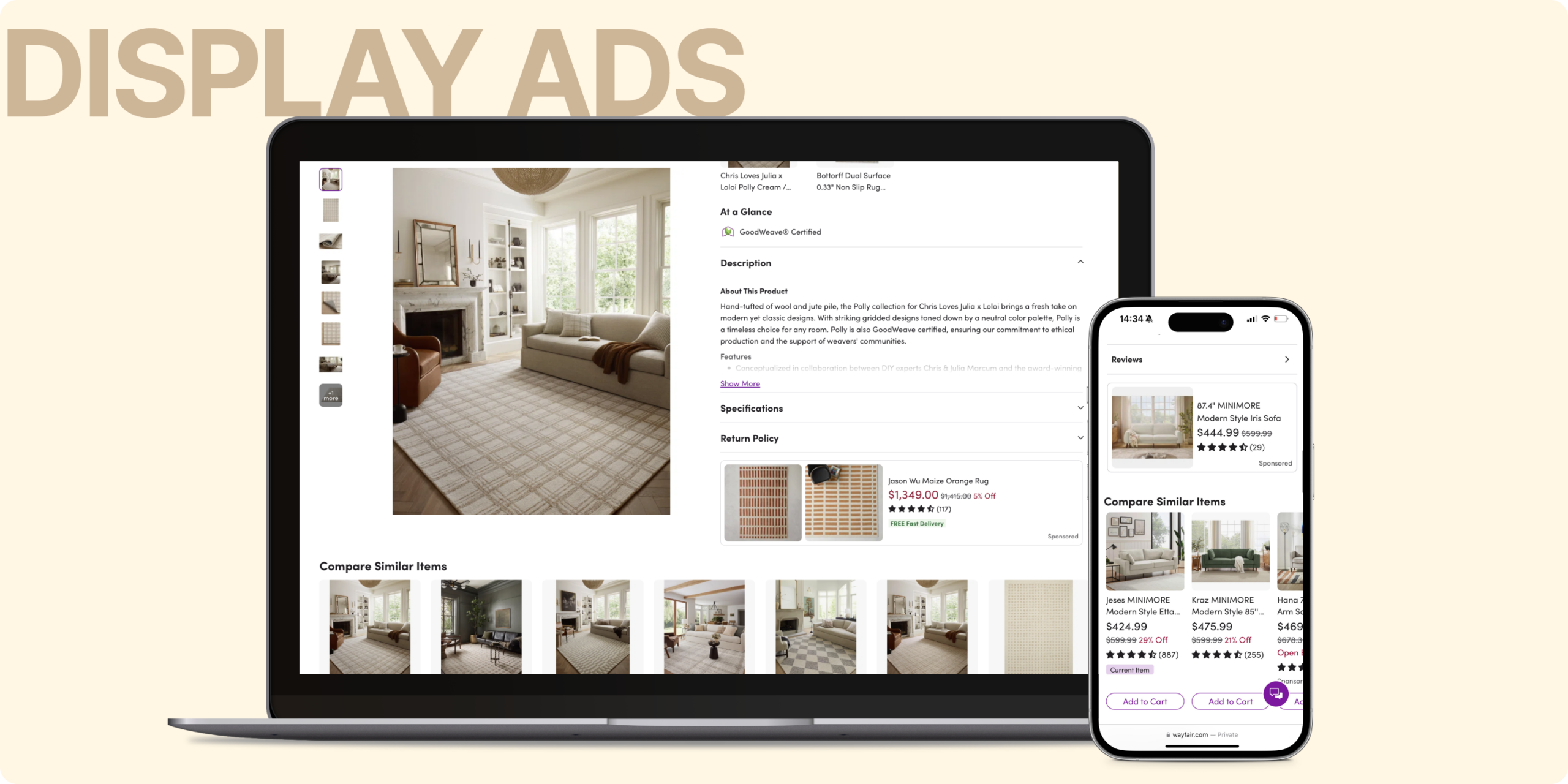
Wayfair - Display Ads2024 . Mobile & Web . Vision & Strategy
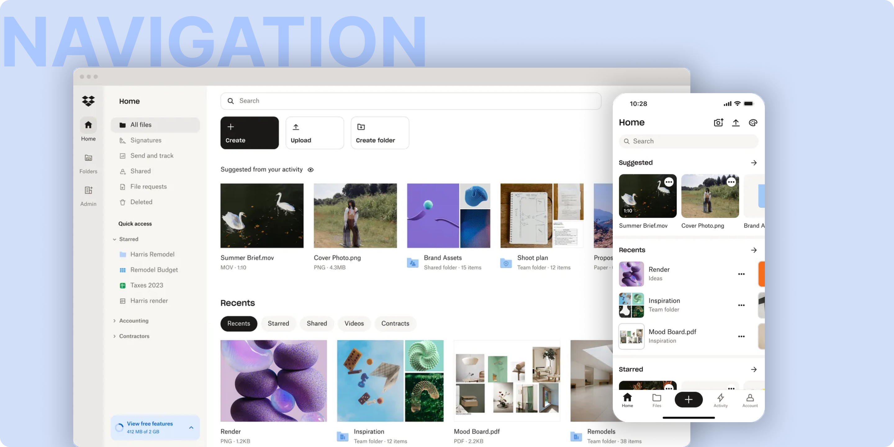
Dropbox - Browse and Navigate2024 . Mobile & Web . Vision & Strategy
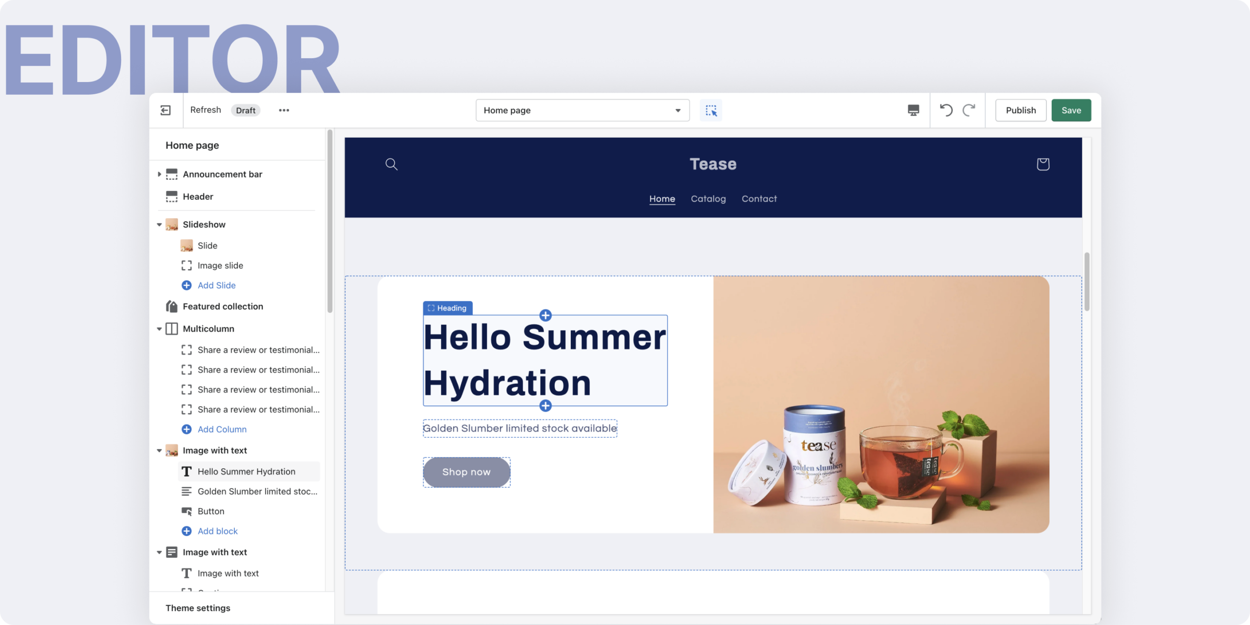
Shopify Editor2022 . Web . Interaction Design
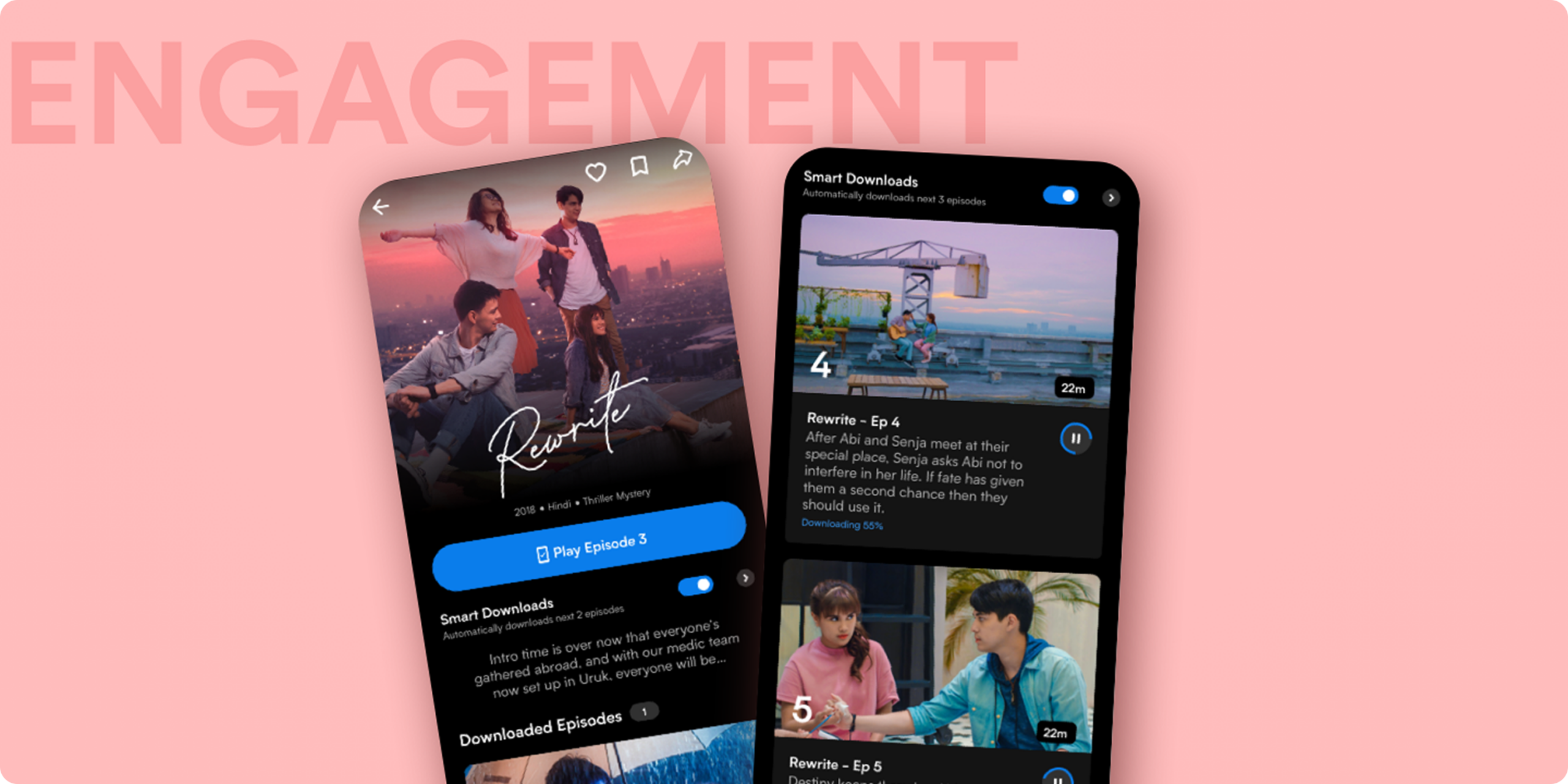
Viu Engagement2018-2019 . Mobile Design . Vision & Strategy
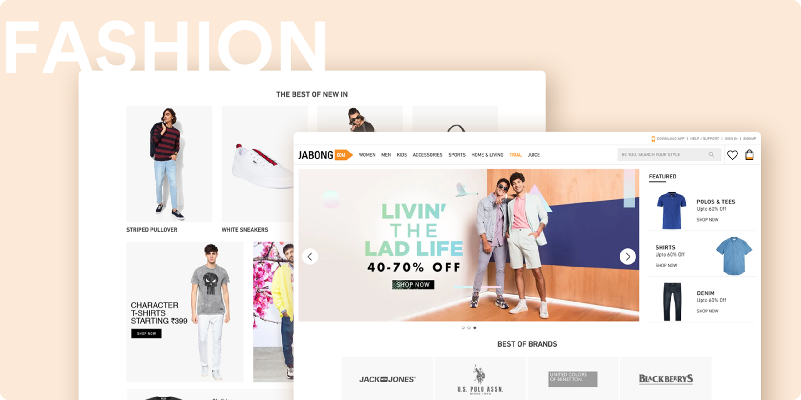
Jabong Fashion2014 . Web & Mobile . Vision & Strategy